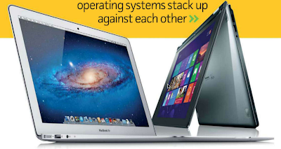
We compare Microsoft Windows 8 and Apple OS X 10.8 Mountain Lion to discover how the two operations stack up against each other.
WITH SUCH A RADICAL departure from the Windows format we’ve used for the 17-odd years since Windows 95 launched, we thought it was time to take stock and see how Windows 8 compares with Apple’s OS X Mountain Lion - and find out whether it’s time to switch.
In releasing Windows 8, Microsoft has taken a huge step toward a unified OS experience across PCs, laptops, tablets, and smartphones. Where once small icons and a Start menu populated the Windows desktop, the simplified Modern user interface, replete with live tiles and designed to be controlled with touch gestures, is proving an unfamiliar and often confusing new landscape.
Improvements behind the scenes are noticeable, but redesigning the way users interact with their machines was always going to be difficult. Don’t forget, though, that the traditional desktop remains, albeit without a Start menu.
Response to Windows 8 has been mixed. Microsoft claims to have sold 60 million copies. However, there has also been negative press about the frustrating learning curve required by Windows
8’s Modern interface, plus reports of customers (particularly businesses) exercising their right to downgrade to Windows 7 when buying new machines.
One of the problems Windows 8 has faced is its customers’ ability to operate the touch-friendly OS using a keyboard and mouse. It’s certainly possible to use the Modern UI this way, but it can take more clicks to accomplish a task in Windows 8 than in previous versions.
We’re now seeing desktop and laptop PCs manufactured with the Modern UI in mind. These devices feature touchscreens, gesture-supporting touchpads, and even some unusual convertible designs that enable laptops to transform into tablets. Finally, it’s possible to experience Windows 8 as Microsoft intended.
Since it isn’t possible to run older applications in the Modern UI, Microsoft has been forced to retain the traditional desktop environment, making Windows 8 an operating system of two halves.
In this article we compare both sides of Windows 8 against Mountain Lion. We compare the two OSes in their out-of- the-box condition, with no third-party browsers, email clients, photo managers, or any other software installed.
We’ve tested Windows 8 using Lenovo s Yoga 13, an ultraportable laptop with a 13-inch screen that can be turned 360 degrees and folded flat against the keyboard to form a tablet. For OS X we’ve used a 13-inch Apple Macbook Air.
We’ll look at every facet from the obvious interface design to the bundled apps, security, file sharing and more.
Windows 8 has been out in the wild for five months now, had its preliminary patches applied, and seen the introductory upgrade offer consigned to history. Now things get serious: so it’s Microsoft vs Apple, Windows 8 vs OS X Mountain Lion. Read on to find out how two different design concepts stand up to the mundane reality of everyday computing.
INTERFACE DESIGN
APPEARANCE
Windows 8
Let’s start with the new Modern UI.
There’s no doubt that this represents
one of the boldest moves made by Microsoft in Windows’ history, and each new Windows device proudly displays the colourful and dynamic design.
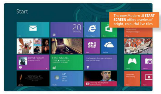
The Start screen, which replaces the old Start Menu, is an interesting environment. Large boxes form a multicoloured grid that sits on top of a customisable background. Several tiles are live, frequently updating themselves to reveal the latest sports news, search trends on Bing, weather in your location, or news headlines. The desktop app tile displays the wallpaper in use on the traditional Windows desktop.
The use of images to accompany the constantly changing news makes the Start screen experience seem alive and interesting, almost to the point of distraction. Leaving open this Start screen while perusing a document on a second screen can be a hazardous affair: your eye will invariably be drawn to the flashing and flickering of transfer rumours, or the startling news that dolphins are one of the most searched-for terms on the internet today.
For the more organised user, there’s the option to group the icons in columns. This is achieved by dragging them into a new grid, then using the pinch gesture (or mouse’s scrollwheel) to zoom out, clicking on the column and then naming it.
Selecting any one of these icons causes it to expand, flip over, and launch the app. This
introduces another significant change to the Windows experience: the full screen app. When using the traditional desktop you can resize individual panes to suit your preference and available screen space. But in the Modern UI, full-screen apps are the order of the day.
The one concession is a snapping’ feature that allows you to stretch an app over three quarters of the screen, with another app squeezed into the remaining quarter. For Twitter feeds and other list- based apps this can work well, but if you want to run anything more complicated then you’ll need to invest in a second monitor or develop a deep kinship with the Windows, Tab shortcut.
This is where the tablet-like nature of the new design begins to rear its head, and may cause those who have grown up using Windows some confusion. Many of the Modern UI apps also have simplified layouts and functionalities (we’ll cover this in more depth later). Even the symbols for loading or processing have been tweaked, with users now watching five little balls orbit around an invisible sun, or a coloured line advancing across the top of the screen until the job has been completed.
Windows 8 looks like a modern OS. When you consider its clean lines and the expanses of empty white space often found onscreen, it seems oddly similar to Google’s most recent version of Android, mixed with a dash of Apple’s traditional minimalism.
The Modern UI is a stark departure from the traditional desktop, which you’ll still use to run legacy applications such as Microsoft Office, Photoshop and your web browser - for the time being, in any case.
On the desktop you can run programs written for Windows 7, Vista or XP, and navigation is largely the same as in previous versions. However, you might want to change several default application settings to prevent situations where you click on, say, an image file on the desktop, and are transported to the Modern UI’s Photos app to view and/or edit it. Some people might not mind this switching about, while others will find it grating.
We’ll explain all later in this feature.
These are all set-and-forget fixes, but during your first few hours in the new environment you may well feel a bit lost - especially if you’re not confident when it comes to altering Windows’ settings.
Arguably the most frustrating element is that Modern UI apps don’t have buttons that allow you to hide or close the window; instead, you drag your finger (or mouse cursor) down from the top of the screen to exit the app, or swipe in from the left side to switch between apps.
If you don’t have a touchscreen then pressing Windows, Tab lets you navigate between open Modern UI apps, and Alt, Tab will cycle through everything. Those who prefer to use their mouse for everything will quickly discover the screen’s new ‘hot’ corners: put the cursor in either left corner to display a list of running apps, or the right corners to bring up the Charms bar.
osx
OS X 10.8 is a windowing OS and much more like Windows 7 than Windows 8, so its not as difficult as you might expect to switch from XP, Vista or Windows 7.
 The latest version is called Mountain Lion, with previous iterations also named after big cats. Instead of fancy new graphics or unified layouts, Mountain Lion instead gets a carefully administered sheen of polish, with some useful features that make your life that bit easier.
By default the OS X desktop is empty, with a dock at the bottom of the screen providing shortcuts to the various programs you can launch. You can achieve a similar look in either Windows 7 or 8 by pinning shortcuts to the taskbar.
Icons arc magnified as you move the mouse cursor over the dock, which you’ll either find helpful or annoying. This action is disabled by default. The dock can also hide itself away when not in use.
Apple’s approach to minimising and maximising Windows has always been a tad confusing. Clicking the green + button (zoom) can sometimes mean the window increases to fill the screen (while retaining the menu bars at the top); on other occasions it fills only the height of the screen.
Since the release of OS X Lion, Apple has also included in many of its apps a full-screen button. This not only expands the window in question, but removes the top menu to utilise the entire screen.
So, while Apple was first to approach the concept of full-screen apps, Windows was first to make them mandatory.
NAVIGATION
Windows 8
The visual redesign of Windows 8 is striking, but it’s nothing compared to the overhaul that has taken place in terms of how the user navigates their way around the system. It’s in this respect that the two operating systems are most notably different.
In Mountain Lion the multitouch trackpad can become the fulcrum of the entire user experience, while Microsoft has decided that in Windows 8 the touchscreen should be the primary control - at least when you’re navigating the Modern UI.
As you might imagine, this dictates many of the decisions developers have to make in regard to app performance and hardware design. This became clear to us when we were considering which machines to use for this feature. OS X controls behave in the ...


0 comments:
Post a Comment