On the desktop, the new tabs will appear just above the inbox, so you can switch between them with one click.
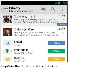
On Gmail for Android (4.0 and up) and iOS, non-Priority tabs appear in the left sidebar menu, and as teasers in the main inbox view.
The auto-sorting inbox isn't mandatory. In a blog post, Google says users will be able to switch back to the Classic
 |
How Gmail Will Sort Your Email for You |
view, or use Priority Inbox.
The new inbox does seem reminiscent of Priority Inbox, which launched nearly three years ago. With Priority Inbox, Gmail attempts to figure out which messages are most important and brings them to the top. (The feature's reception has always been mixed.)
For users who don’t receive a lot of deals and notifications, the additional tabs may be a hassle, as they'll require more effort to sort through.
And we’ll have to see whether Gmail's algorithms work properly and don't end up putting important email into non-Primary tabs.
At this writing, Google says it's rolling out the new inbox gradually. On the desktop, look for a 'Configure inbox' option beneath the gear icon.
0 comments:
Post a Comment